
Reimagining Toolbars in Cricut Design Space - Case Study
Balancing persistent tool access with maximum canvas design space on desktop.
Overview
Cricut Design Space users rely on a dense set of tools to create highly detailed, production-ready designs. However, user feedback revealed a core tension: crafters want all essential tools immediately accessible, but also want maximum canvas space to work freely and precisely.
This case study explores how we addressed that conflict by rethinking toolbar placement and hierarchy on desktop.
Problem
Through qualitative feedback and usability signals, we identified two competing user needs:
Power users want efficiency and consistency
They prefer all core tools (object manipulation, text, alignment, arrange, transform, etc.) available in one persistent location.All users want more canvas space
Especially for detailed design work, users want less UI chrome and more room to focus on their creation.
Core tension
Users were effectively asking for:
“Give me everything all the time… but also get out of my way.”
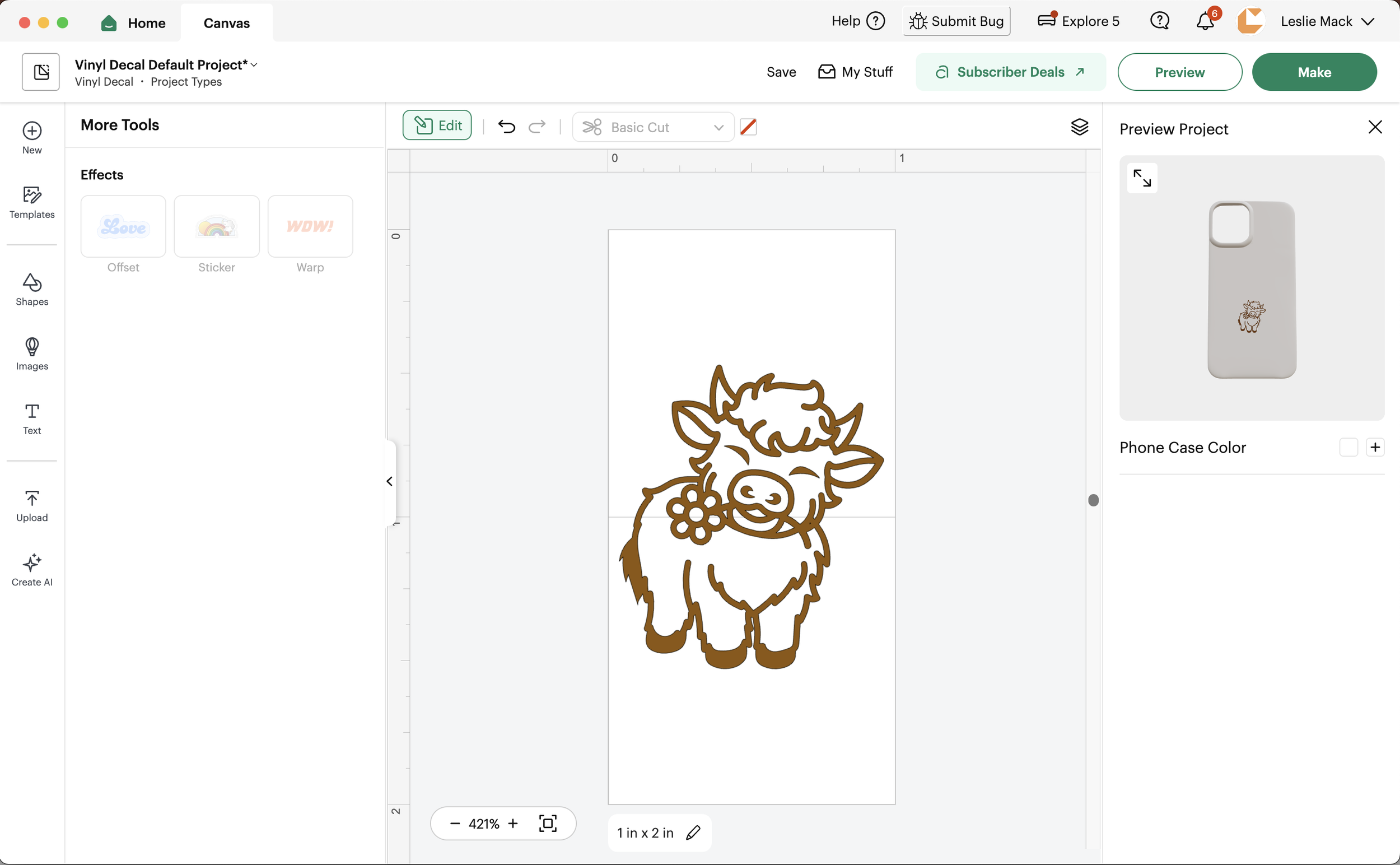
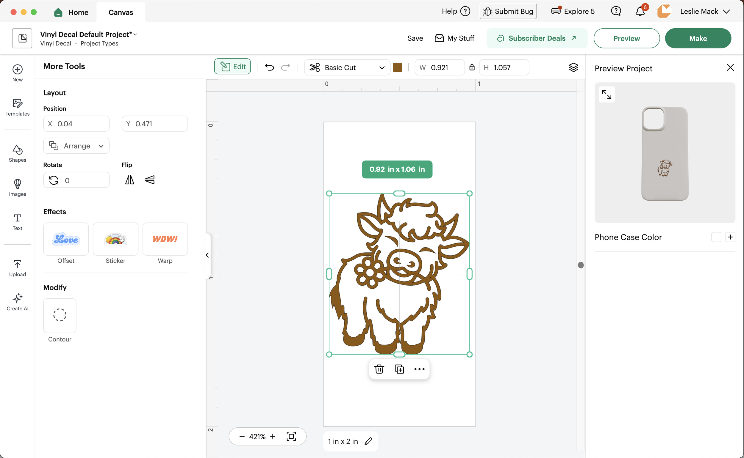
Above is the toolbar launched in Q4 2025, which received significant negative user feedback. It introduced an Edit button that opened a contextual left rail, changing based on the selected object type.
As shown with the cow image example above, the toolset shifted dramatically between selected and deselected states, creating inconsistency and confusion about where tools lived and when they would appear.
While cut conversion saw a slight decline, user complaints were substantial. When I joined the team, they were already exploring a new direction, which I helped lead.
Design Principles Defined
I established three guiding principles:
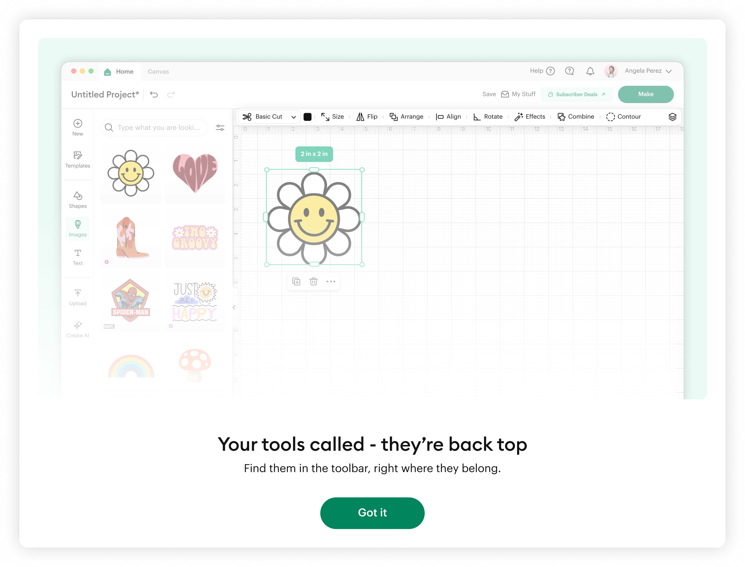
Persistent over hidden
Core tools should remain consistently visible.Hierarchy over compression
Reduce clutter through grouping, not removal.Canvas first experience
The interface should visually prioritize the design surface.
Goals
Redesign the desktop toolbar experience to:
Preserve fast, predictable access to high-frequency tools
Maximize usable canvas space for design work
Reduce cognitive load and tool hunting
Maintain scalability for future tool expansion
The 3 Concepts Tested
Research & Insights
I synthesized feedback across three prototype variants in collaboration with our UX Research partner. Based on strong early performance, we further evaluated the top toolbar concept through focused usability testing. We then combined user insights, observational data, and team feedback to define and finalize the MVP direction.
Key insight 1: “Location memory” matters more than space efficiency
Users developed strong muscle memory for where tools live. Hidden or context-shifting tools created friction.
Key insight 2: Canvas space is emotional, not just functional
Users equated larger canvas space with:
Creativity freedom
Professional control
Reduced clutter and distraction
Key insight 3: Tool discovery vs. tool retention conflict
Users do not want to search for tools they already know, but they also dislike visual overload.
The Solution
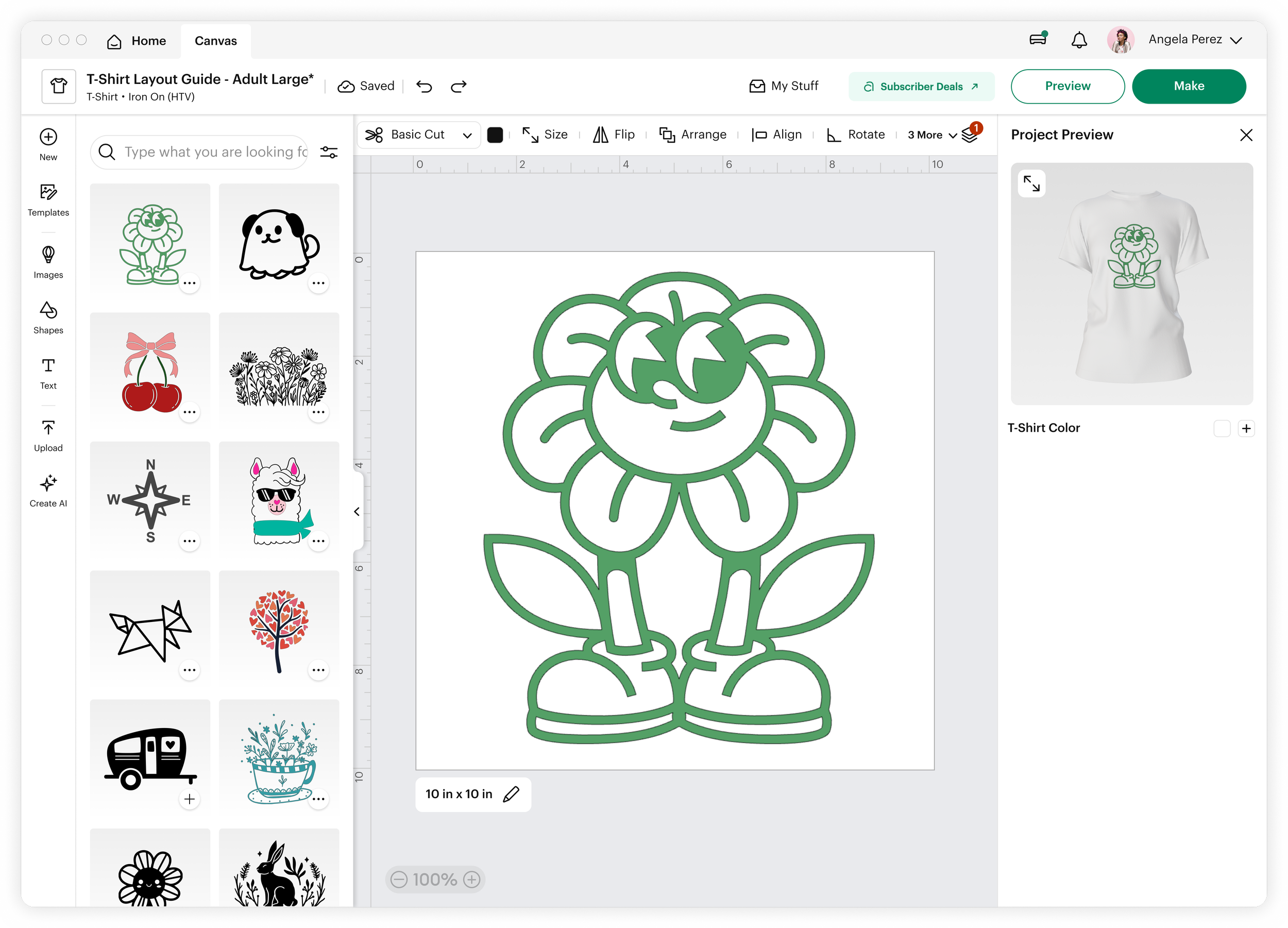
I redesigned the toolbar system to better balance access and space through structural refinement rather than removal.
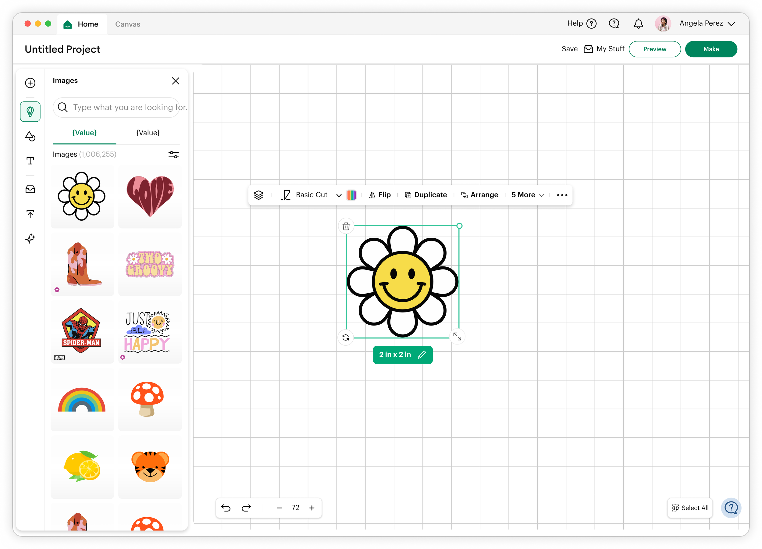
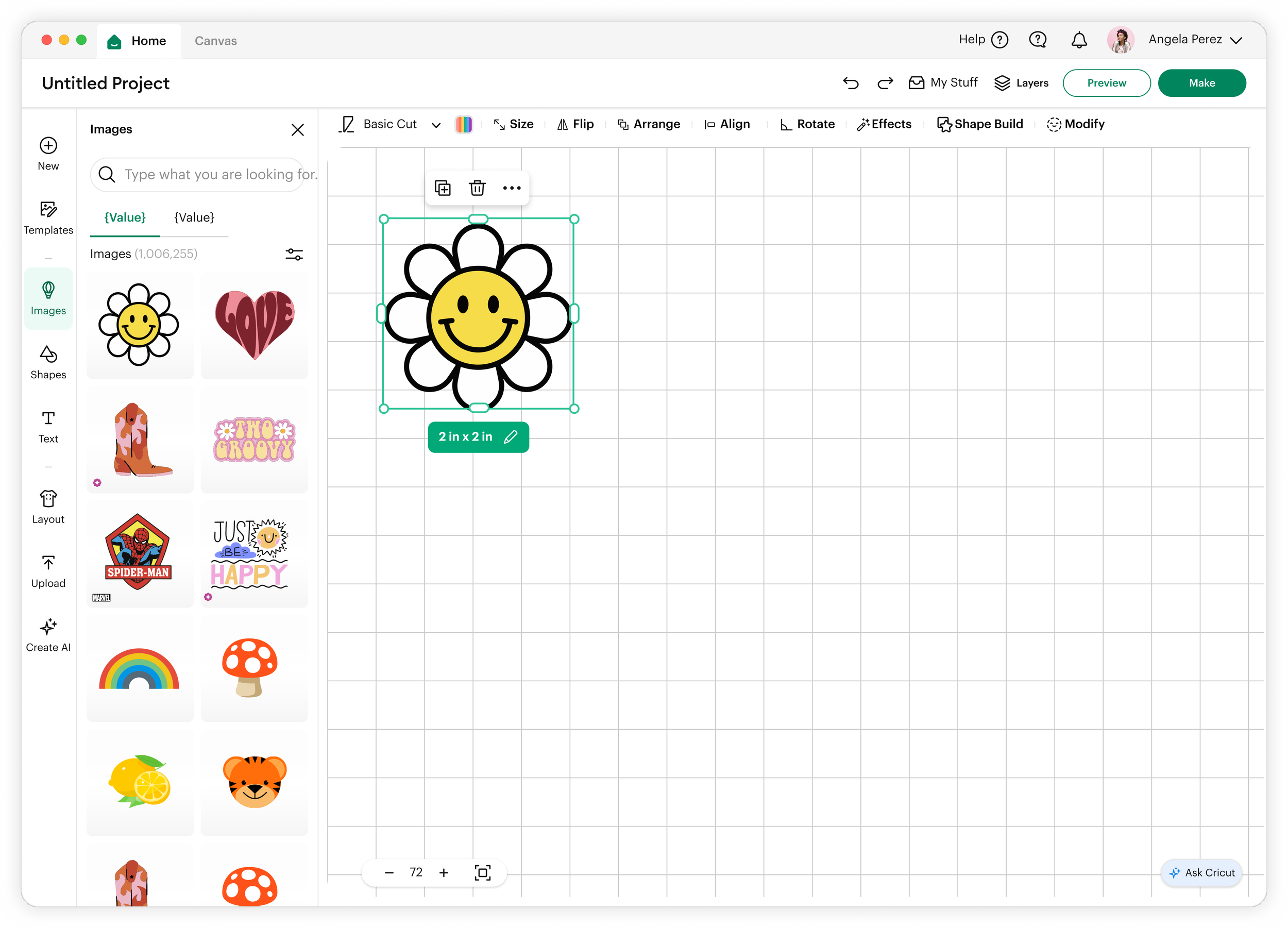
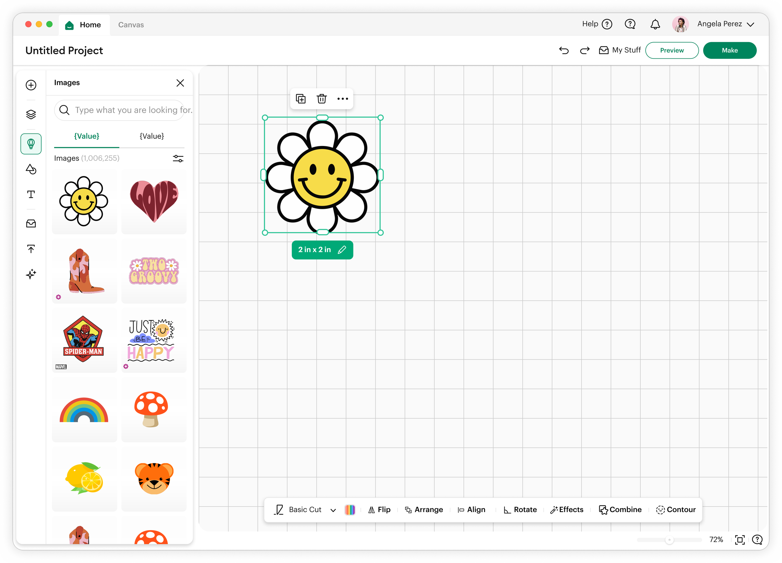
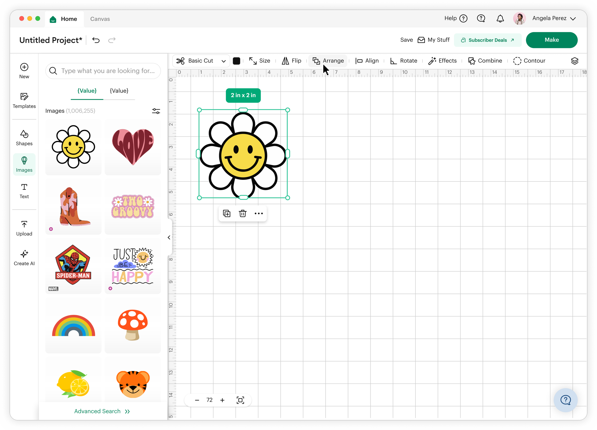
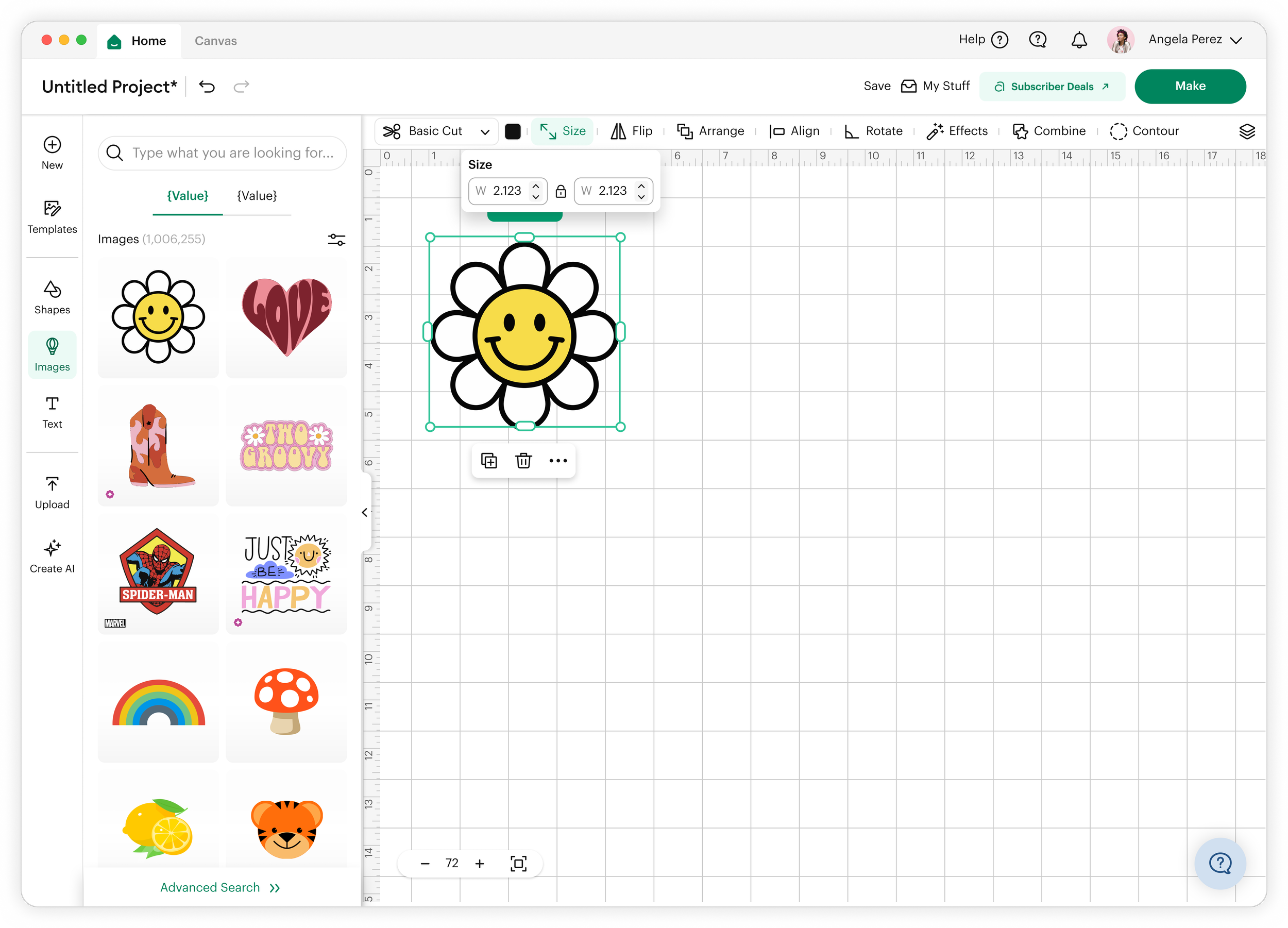
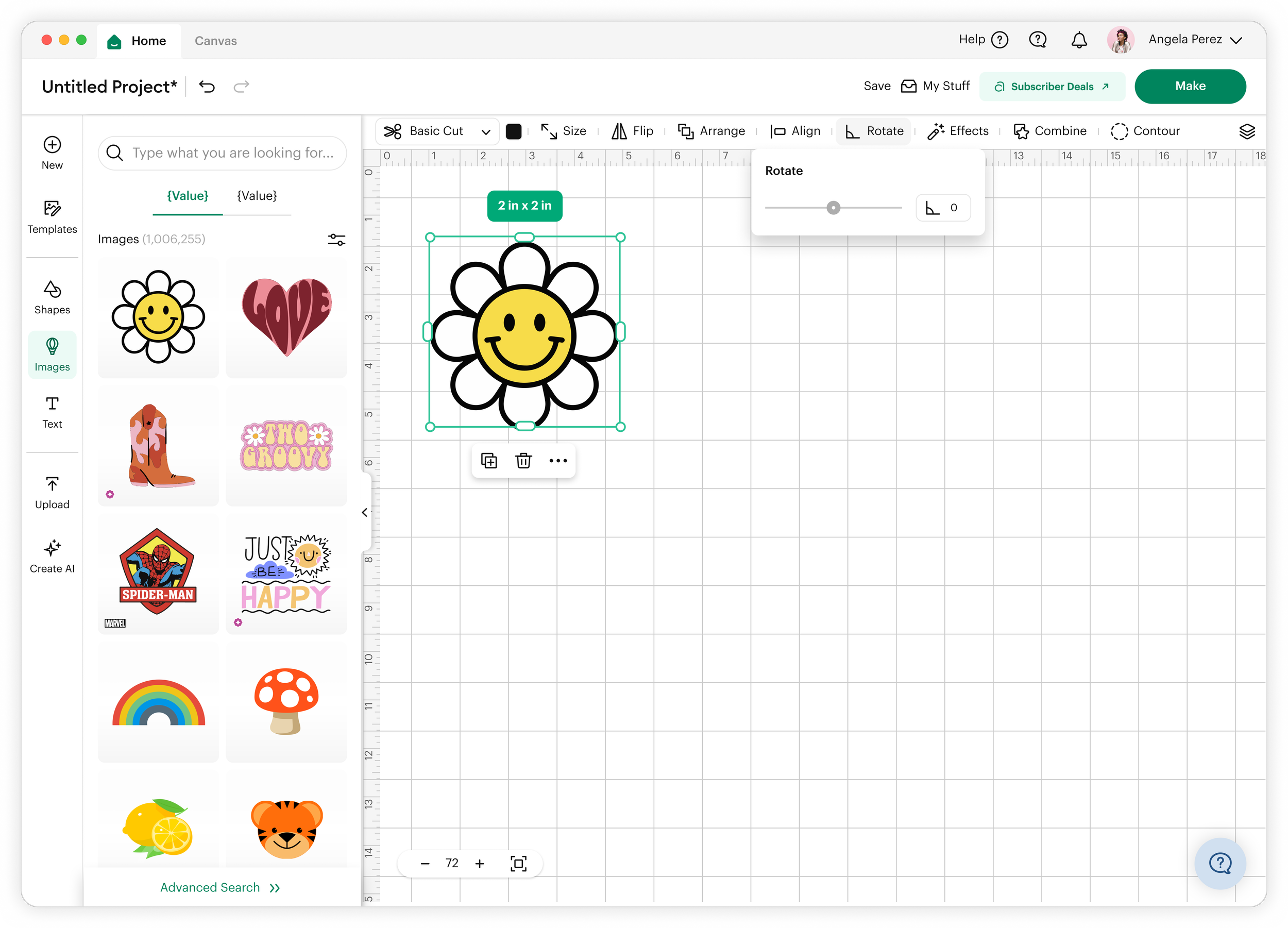
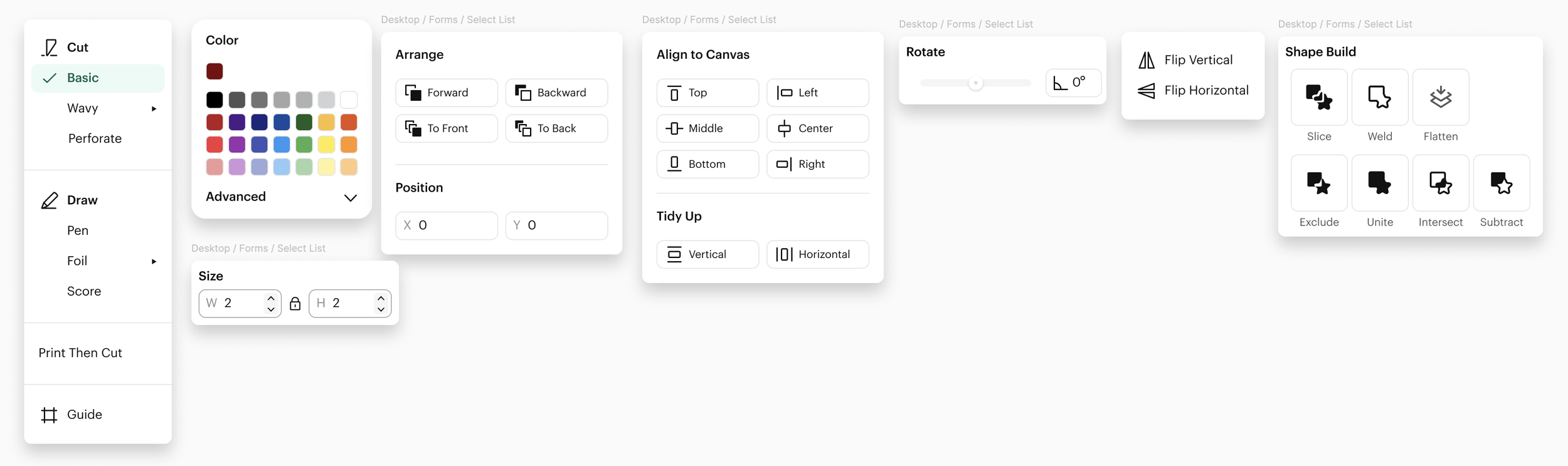
1. Consolidated top-level tool grouping
Core tools were reorganized into a unified top toolbar with clear grouping logic (e.g., Arrange and Position grouped as spatial controls).
This preserved:
Muscle memory
One-click access
Predictable tool locations
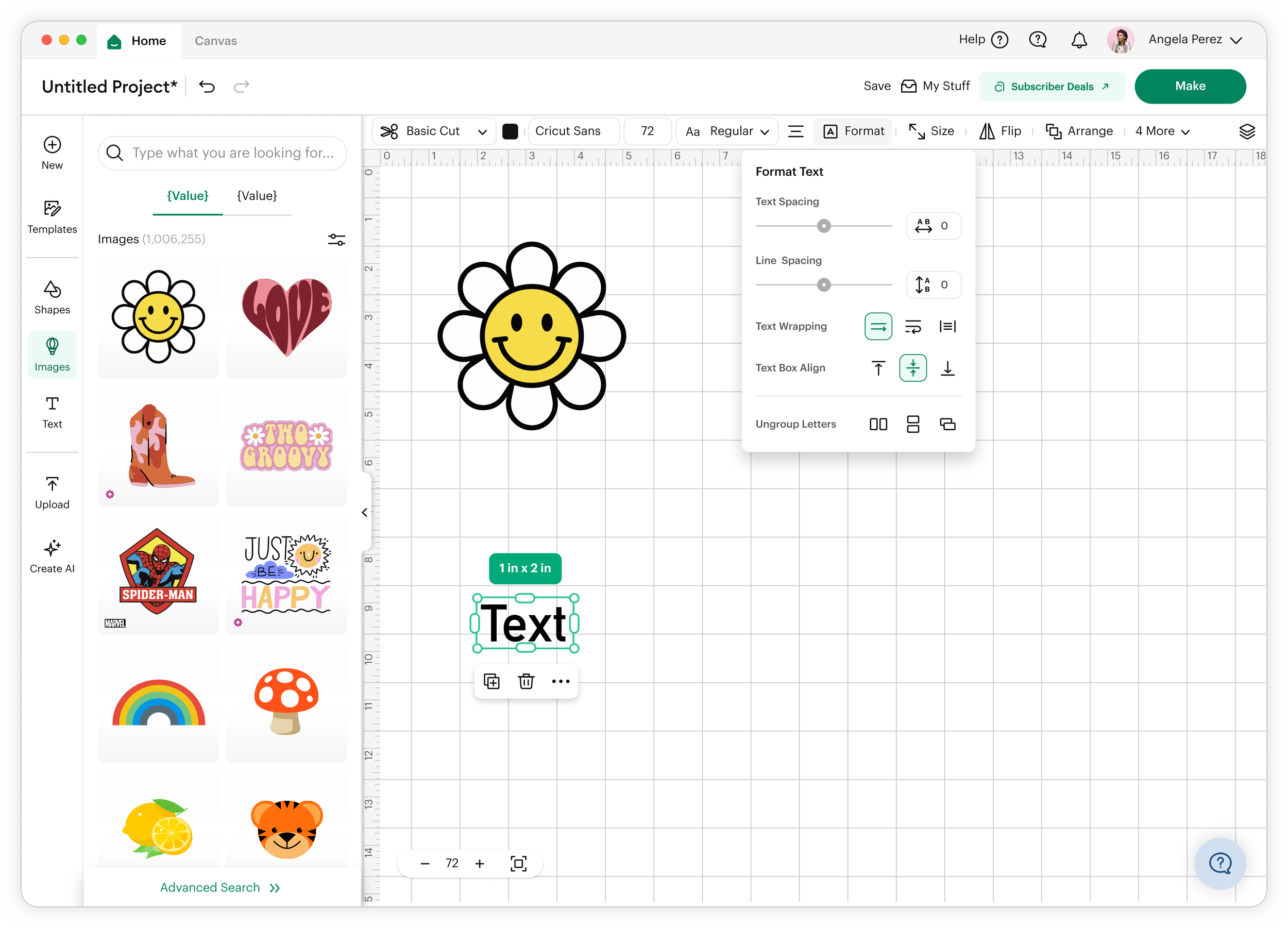
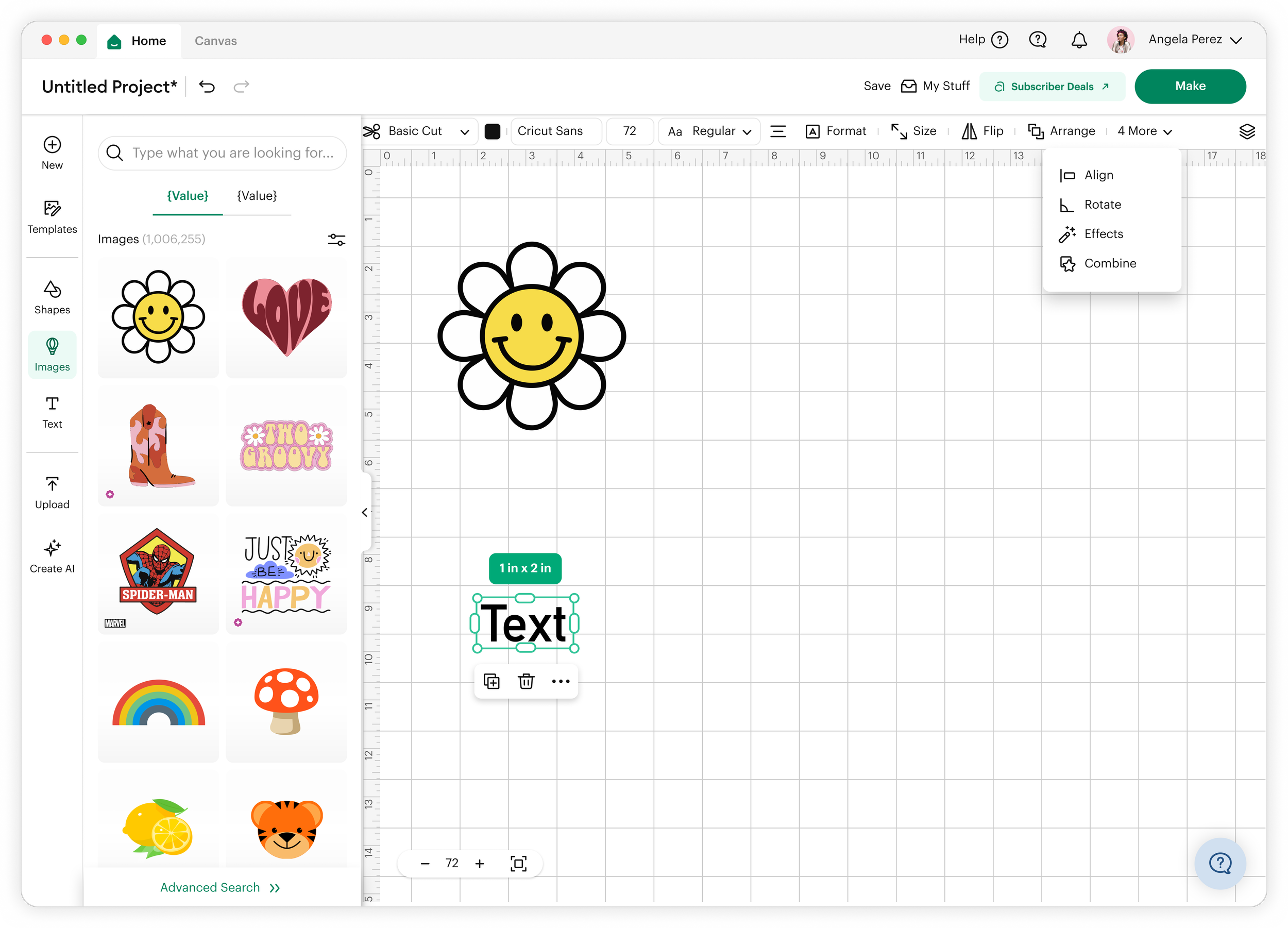
2. Contextual surfacing instead of persistent duplication
Less frequently used tools were moved into contextual panels tied to object selection states, reducing always-on UI clutter.
3. Canvas prioritization through UI compression
We reduced vertical UI weight by:
Tightening toolbar spacing
Collapsing secondary controls
Prioritizing iconography over text where safe
This expanded perceived and actual canvas space without removing essential functionality.
4. Adaptive visibility model (future-ready foundation)
We introduced a framework where tool visibility can scale based on:
Crafting workflow (i.e. stickers, vinyl, t-shirts, etc)
Screen size
Task complexity
Outcomes
Key Takeaway
Great design tool interfaces are not about choosing between access and space—they are about structuring complexity so both can coexist.
By prioritizing persistent mental models and reducing visual noise through hierarchy, I created a toolbar experience that supports both power users and creative focus.
The redesign achieved a balanced system that:
Preserved fast access to high-frequency tools
Increased usable canvas space on desktop
Reduced visual clutter without sacrificing functionality
Improved perceived control and design confidence
Early feedback indicated users felt:
Less “boxed in” while designing
More fluent in tool usage
More focused on their creative output